Profile: Clap Studio: One to Watch
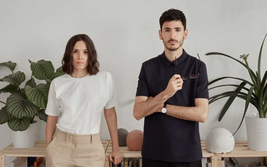
In the years since they founded Valencia-based Clap Studio in 2016, Jordi Iranzo and Àngela Montagud have received prestigious industry honours for their interior design projects from the German Design Award, the Frame award, and the Dezeen Awards. In this short time, they have worked on projects in Spain, Hong Kong, and Belarus, and their work has appeared in AD Spain.
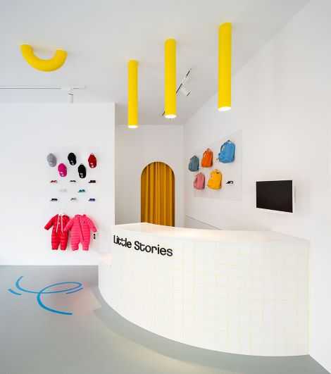
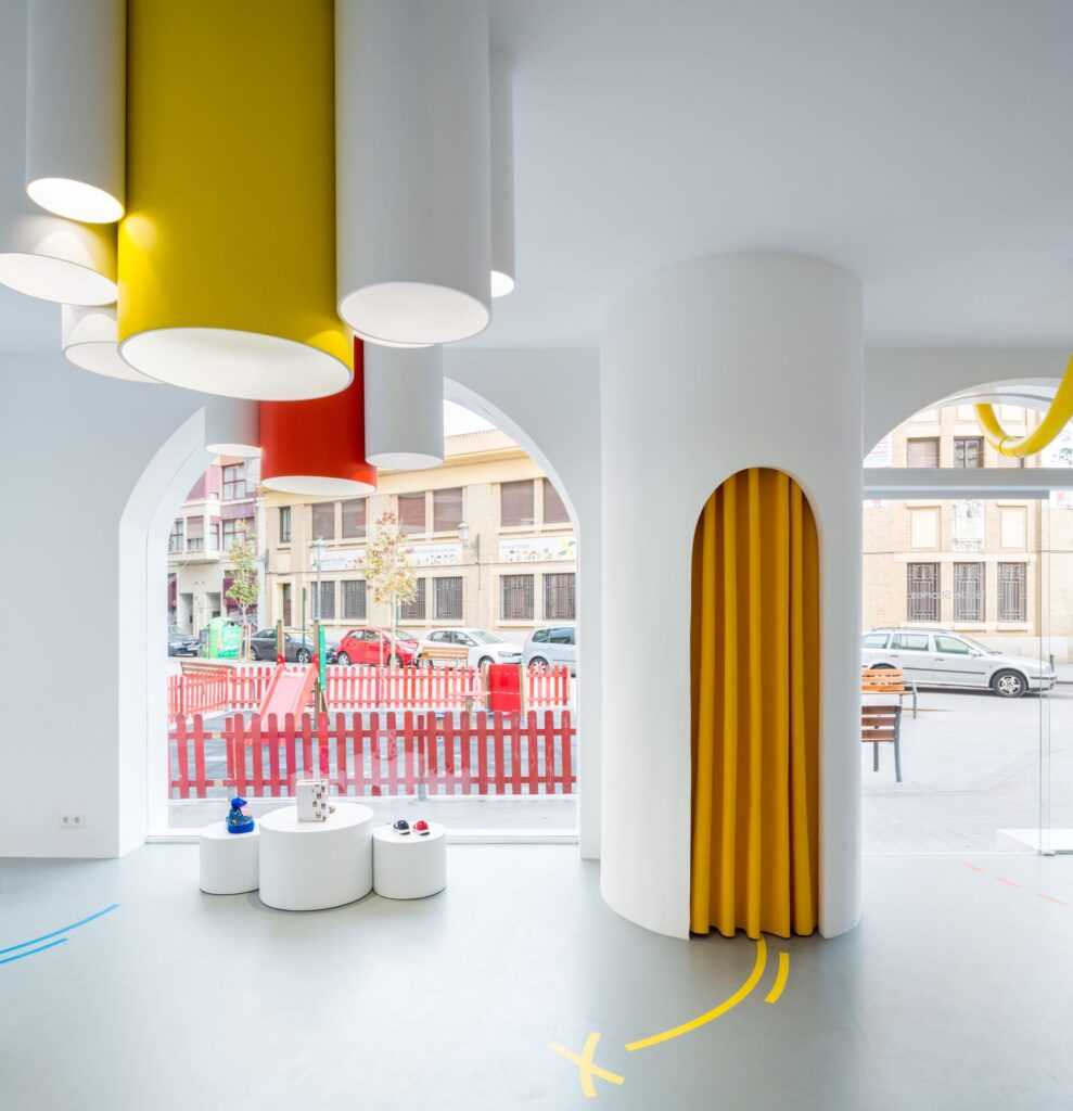
Like many of the most dynamic studios, Clap Studio expands the design paradigm, erasing boundaries between interior design, architecture, product design, graphic design, and branding. Their designs are highly conceptual, and they describe their work as within the minimalist design aesthetic. Images of their award-winning retail design for children’s clothing store Little Stories show that their interpretation of this aesthetic rejects the coldness too-often associated with a minimalism that leaves no room for the warmth brought about with the use of bright, punchy primary colours. Lucky is the child who enters Little Stories!
Jordi studied industrial design, which he began at EASD Valencia (Escola d’Art i Superior de Disseny de València) and completed at Burg Giebischenstein in Halle (Germany). Angela is a Technical Architect and completed a master’s degree in Digital Marketing and Communications.
They spent a few years publishing the digital magazine More with Less from Valencia, which featured product design projects, architecture, and interior design. They opened Clap Studio in 2016. After some time running both businesses, they decided to focus on the studio.
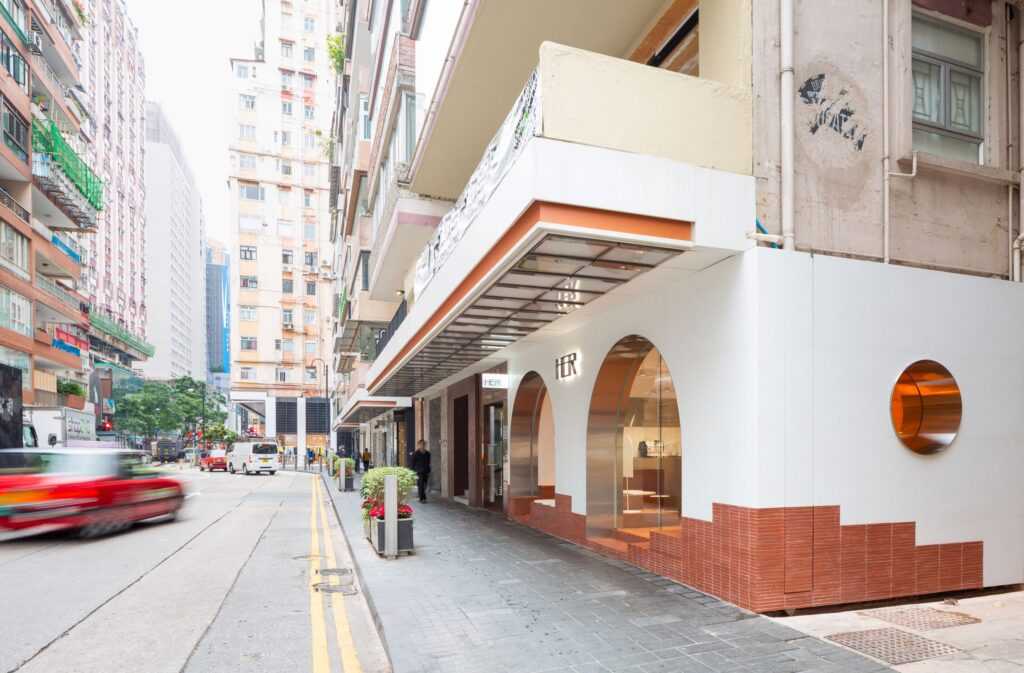
HER (Hong Kong) 2019
Photography by Daniel Rueda (@drcuerda), courtesy of Clap Studio.
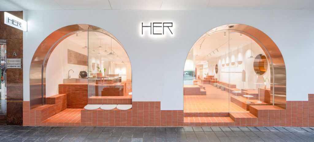
HER is a womenswear boutique-cum-café in downtown Hong Kong, in the center of Fashion Walk. Owned by local stylist Hilary Tsui (@_her.official_), she wanted a contemporary space that combines her passions for fashion and gastronomy.
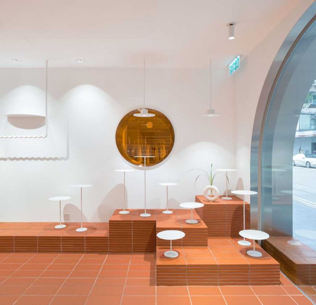
CLAP studio devised a three-pillar concept to reflect the essence of HER: femininity, purity, and strength. From this starting point, they imagined HER as a “sinuous landscape with impressive mountains and pure materials, a new space yet to be discovered, like the planet Mars.” The terracotta tile floorIng, laid in a grid pattern, is the point from which all geometric volumes rise, like mountains.
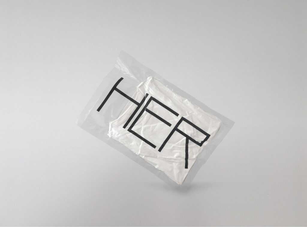
The customer experience simulates travel in a spaceship, from the point of entry through a facade that shows the mountainous landscape of the interior to the final moment, receipt of a vacuum-packed purchase. Customers enter the space through one of two aluminum-clad arches. One is the entrance to the takeaway HER Cafe and the other to the retail area.
The interior has two zones: one for the cafe and the display of athletic footwear and activewear, and the other for the boutique, which sells jewelry and accessories from independent clothing firms, including Anais Jourden, Pushbutton, and Chance. The terra cotta tile “mountains” are used for product display or as seating for customers to relax.
The project won Clap Studio the 2020 German Design Award 2020 and was on the 2019 Longlist for Best Retail Interior of the Year by the Dezeen Awards.
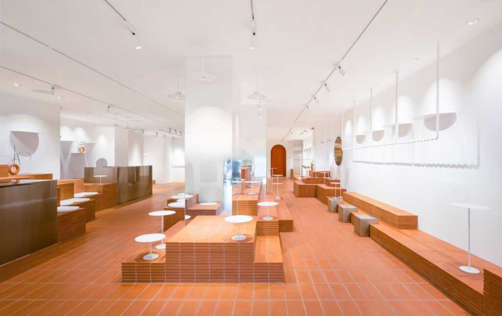
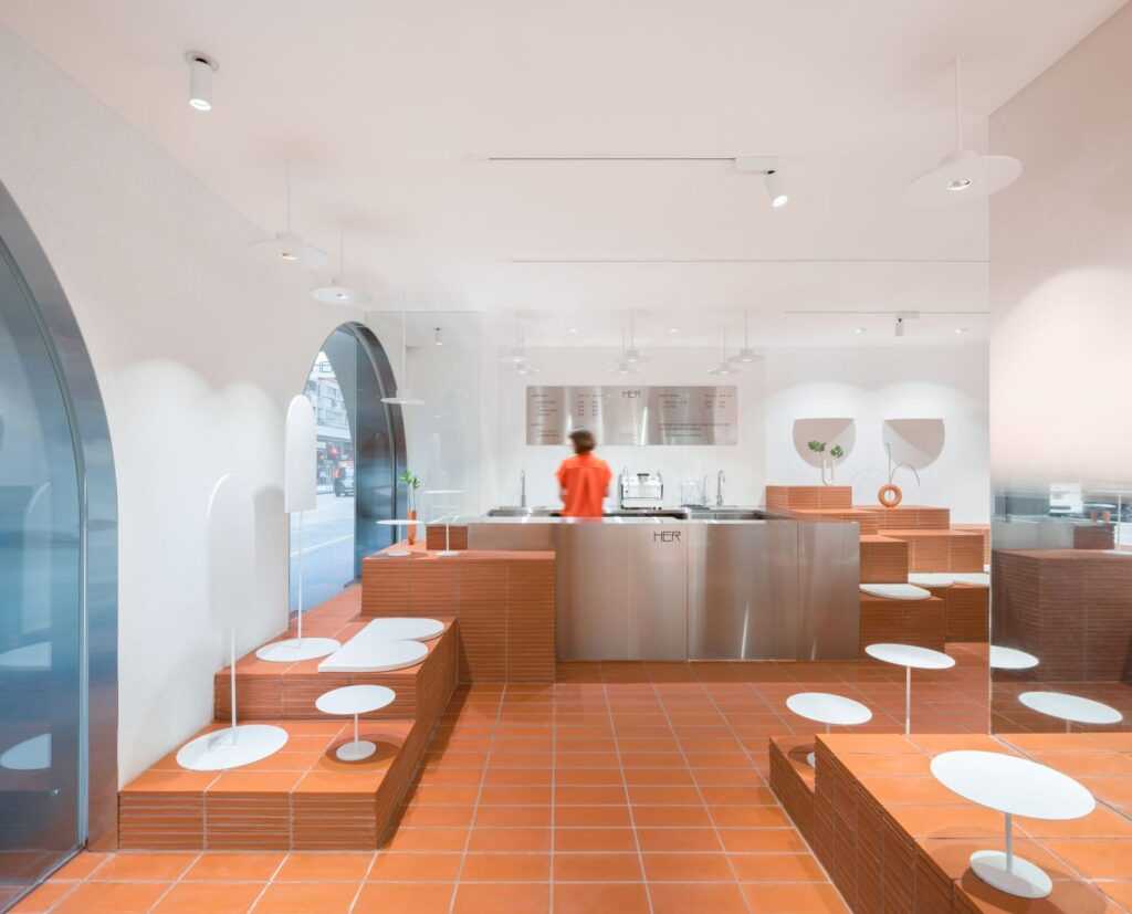
Small white lotus leaves grow from the terracotta tile “mountains” to highlight products on display.
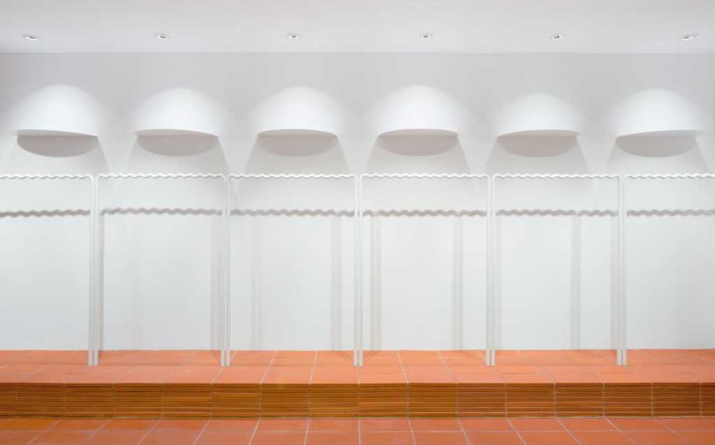
The coat racks are designed with a wavy profile so that clothes hang at equidistance from one another.
Mist (Minsk, Belarus) (2019)
Photography by Alexandra Kononchenko by @kononchenko, courtesy of Clap Studio.
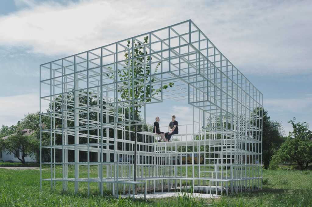
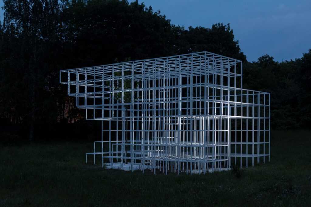
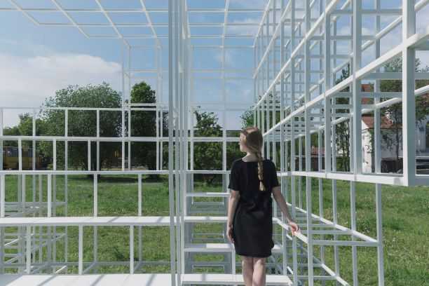
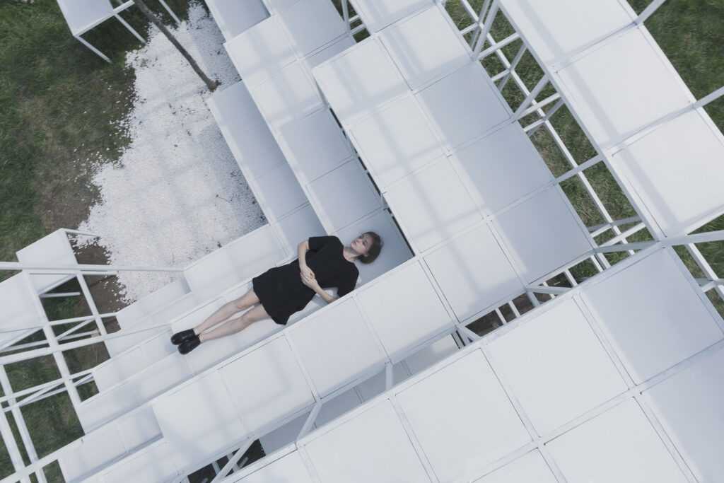
Mist was an installation in Minsk, Belarus Clap studio created in collaboration with Wei Lesley Yang (@wlesley_yang) for the 2019 Minsk Design Week (@minskdesignweek2019). The principal installation during Minsk Design Week, local volunteers came together to build it. The objective was to create a memorial to the city and a space for gathering, relaxing, and finding peace.
The city suffered devastation during the Second World War when bombs destroyed 80% of the buildings and not rebuilt until the 1950s. These unpleasant memories have been etched in the minds of the people and become a taboo subject. Based on the definition of ‘popularization’, the topic suggested by the Minsk Design Week organization, Wei Lesley Yang and Clap Studio designed the installation to bring a taboo subject closer to current society in an understandable manner. It would serve as both a memorial and a reminder of the victims.
The concept is straightforward. The geometric volume represents the volume of a building. Bombs fall on and destroy it, which generates new openings and volumes. On top of the structure, the open areas serve as an entrance and a viewpoint. The destruction of bombs leads to the formation of stands, stairs, and seats. However, life makes its way inside the structure in the form of a tree. The tree exceeds its height.
Mist is a fuzzy but latent memory of all those buildings that suffered destruction during the war and could no longer be inhabited.
Fan for Gandia Blasco (2018)
Photography by Clap Studio.
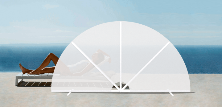
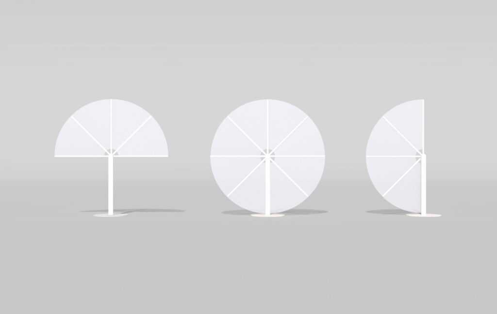
FAN is Clap studio’s winning project for the twelfth edition of the International Outdoor Furniture Competition organized by the Valencian-based outdoor furniture company Gandia Blasco.
A reference to the simplicity and practicality of the hand fan, a Spanish cultural icon, FAN consists of two separate screens that provide sunbathers with privacy, subtly and elegantly, while also protecting them from wind and light.
Little Stories Concept Store (Valencia, Spain) (2017)
Photography by Daniel Rueda (@drcuerda), courtesy of Clap Studio.
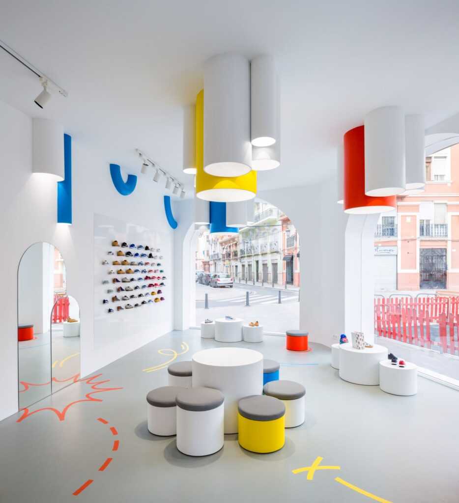
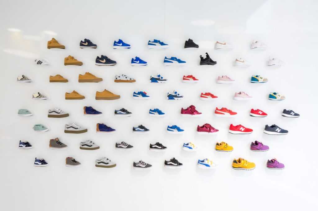
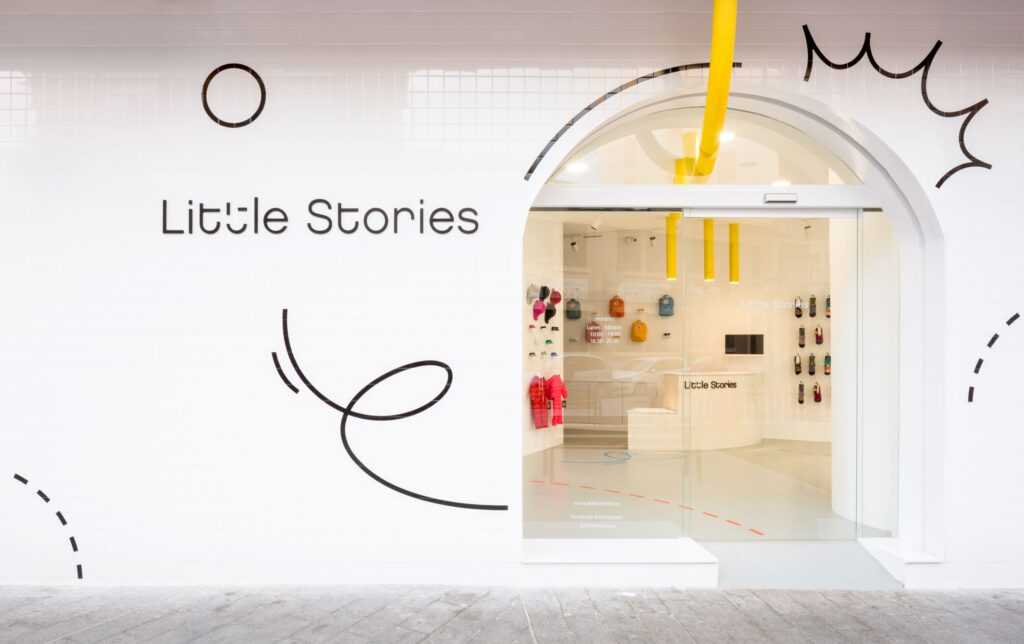
Little Stories is a shop in Valencia, Spain that sells children’s footwear and accessories. The design brief was to create an experience for children based on three concepts: game, simplicity and adaptability. Clap studio designed every detail of the interior to encourage imagination and highlight the products on display and also developed the shop logo and signage to create a strong corporate identity.
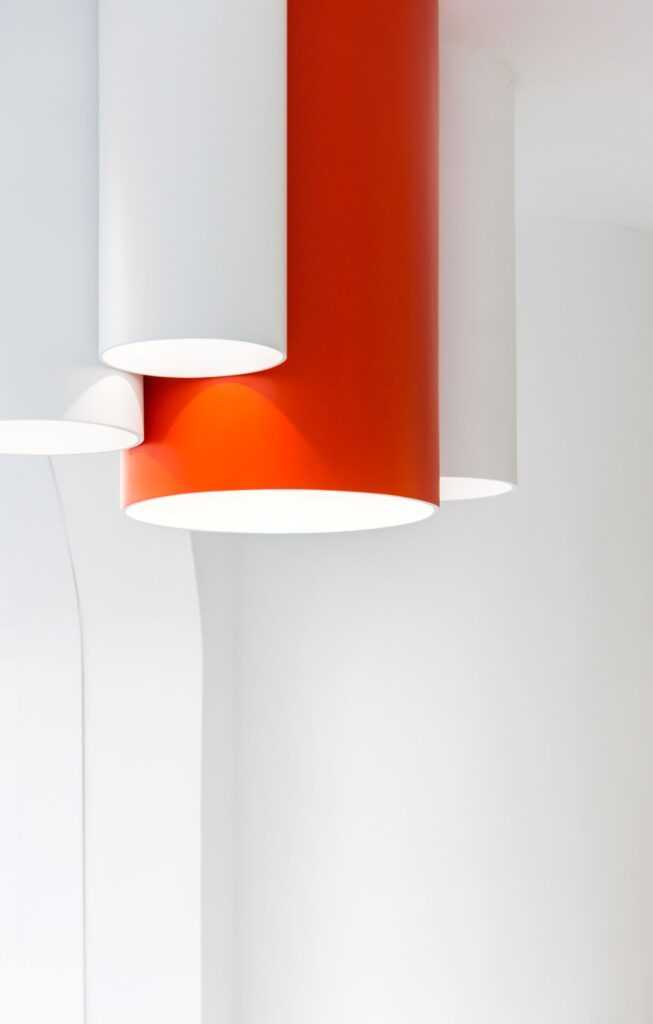
The 70-square meters open space has large windows, making the interior feel like an enormous shopfront. The floor stands and metal wall plates, which are modular, adapt to the requirements for display. Lighting built into ceiling mounted tubes illuminates products.The studio devised user-friendly logo and signage in simple, minimalist sans serif typography and a system of lines that represents, articulates and expresses the shop’s multi-format brand identity.
For this project, Clap studio received a nomination for the 2020 German Design Award, won the 2019 FRAME award in the category of Best Multi-Brand Store of the Year and was on the 2018 Longlist for Best Retail Interior of the Year by the Dezeen Awards.
La Fábrica de Ideas (Valencia, Spain), 2017
Photography by Daniel Rueda (@drcuerda), courtesy of Clap Studio.
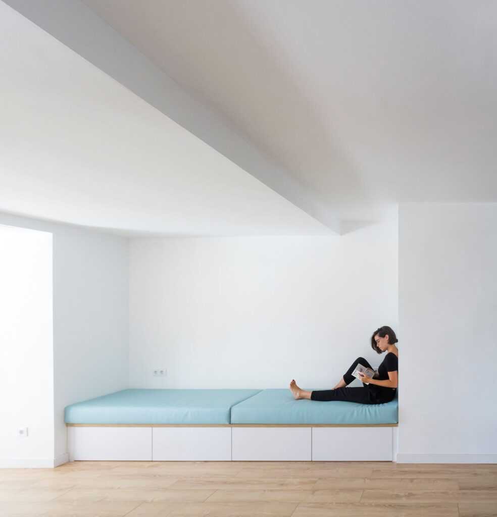
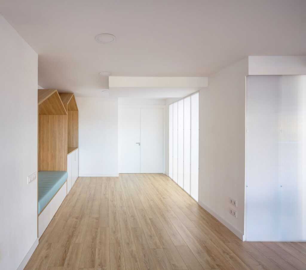
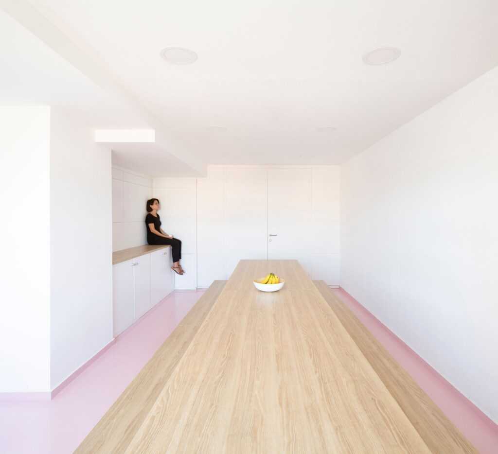
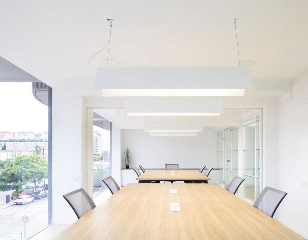
Ten partners in a Valencia-based company dedicated to event organization wanted their headquarters to be a coworking space that balances work and rest. Clap studio devised a concept around four objectives: comfort, teamwork, rest, and game.
A load-bearing wall divides the 300-square meters space into two areas, one for rest and the other a work zone with more natural light. There is further differentiation between the two through the use of materials and tone. In the rest area, cool colours and materials encourage users to relax and disconnect from work. In the work area, with its multi-purpose spaces, warmer materials, and colours promote teamwork. With sofas along the perimeter and a coffee corner, the large open space has an area for informal meetings.
How have you approached building a client base thus far?
There is no secret. It is about effort, dedication, and communication.
What have been the highlights thus far?
We enjoyed and are super happy with our Little Stories project. It won the Best Multi-Brand store of the year by FRAME. Another highlight is HER in Hong Kong, which has been one of the best experiences we have had as a studio. The project won a German Design Award this year.
Your website bio page states: “We are a creative studio focused on the design of experiences through interiors, products and artistic installations” Do you think studios now have to work at the intersection of design, art, and industrial design?
We do not think that studios have to work at this intersection, although we do. There are many types of studios. Each has its design philosophy and way of understanding methodology and projects.
What are your inspirations or influences?
Our influences are from the fields of design, architecture, and art. Our references are Nendo, Snarkitecture, Sou Fujimoto, Kengo Kuma, and Sanaa.
In some ways, it seems your design fits into minimalist aesthetics? Do you agree, or does this designation not capture it?
Yes. Our mission is to minimize materials and shapes as much as we can. We believe that if a design in white makes sense, it is perfect. It does not need the addition of color or texture. If we decide to use additional materials, we have to justify each color, texture, and material.
What is the one consistent aspect of your work thus far?
We have a minimalistic approach in terms of shapes, colors, and materials.
What are your favourite design elements to work with ( color, texture, pattern, light, line, form)?
We don’t know. Our design process always starts from a concept that requires us to play with different elements.
Does your aesthetic or process represent a Spanish, regional, or local style or look?
No.
What is your view of how Spanish artisan traditions or craftsmanship can be part of design processes for Spanish designers working in a contemporary aesthetic?
We believe that collaborations are necessary for creative projects. Artisans provide invaluable input into every interior project.
Your interior design work has been commercial design. Is this a choice?
No, but with a retail design, we have had an opportunity to develop our creative approach. We like to work with brands. It does not matter if they are from the retail or hospitality field. We enjoy knowing more about their strategies and finding the best way to communicate with their audience through their interiors.
What’s your first step when starting a new project?
The first step is always to get to know the client through interviews, dialogue, and workshops.
You won the GANDIABLASCO International Contest for FAN. What was the starting point for this?
For the Gandia Blasco international contest, we wanted to create outdoor furniture that was different, new, and that would fit in with the brand identity. We designed an outdoor space divider in 2016. Now in 2020, with the pandemic situation, this furniture could easily find a place on the market.
Does the studio integrate any environmental considerations into its design processes?
Yes. The starting point for the development of a project is an awareness of the project location. We immediately come up with ideas about the materials we will use, which we keep in mind during the design phase.
In a world of tremendous climatic changes, social upheaval, and movements, where do you think design fits in?
Design aims to solve problems. We believe that creative minds have the power to change things. We solve complex problems with solutions. Sometimes, while we are working in interior design, we identify challenges through our clients’ strategic approach and come up with ideas about how to solve them. It is not interior design but is more about strategic design. Ultimately, as designers, we are experts in finding different ways to solve a problem. It has a lot to do with current situations.
You are both born into the generation of social media. How has social media impacted your reach to the public, potential clients, and the media?
We all need our work to be seen and recognized. Social media has democratized visibility. It is a way for potential clients to get to know our work. Nowadays, it is more important to update your social media than your website.
Any recent events or planned projects about which you are excited?
We have various projects in the pipeline. We are currently developing a project for fashion brand FILA and creating a new art direction for the furniture company MISSANA. We are also designing new furniture pieces for various brands, some of which they will launch soon. We just launched our Domestika course called “Introduction to Retail Design.”
