Casa Decor 2021: 7 Designs to Inspire Your Workspace at Home
The pandemic has pushed millions to work from home, which will likely continue well after it ends. For me, this has been one of the few positive aspects of it. There is no longer the need to rise and travel during dark morning hours of cold winter months, no transport costs, and the absence of the psychological build-up needed to face the day ahead. At home, I work in a space that is personal and stimulating. I am free of the office politics that I had grown to detest. I can easily separate work from my personal life and am grateful that I have a job that allows me to work from home.
During the first few months of the pandemic, I sat on my bed in my north-east facing bedroom, propped against pillows with my laptop on my lap. My “office” began to take a physical toll on me. I did not realise the mental toll it took until, at my physiotherapist’s suggestion, I set up a dedicated office space with a desk and chair. I moved a desk from the basement into my son’s room. I sat on a stylish but uncomfortable vintage Eames fiberglass office chair until I could claim the more ergonomic Herman Miller Sayles chair from my son after Christmas when he received his gaming chair. Although I just had a corner in the room, the physical and mental improvements were immediate. The large south-west-facing room had newly installed floor-to-ceiling windows, through which the sunlight streamed. I suddenly found that I enjoyed climbing the flight of stairs to go to my “office” every morning.
Working from home will be the reality for many after the pandemic. These seven spaces from Casa Decor 2021, Spain’s leading design showhouse, inspire designs that are original, functional, and aesthetically pleasing. Some are dedicated offices, while others are spaces within a larger multi-functional area. Whether colourful and playful, calm and serene, or austere and minimal, there are many ideas to suit different design styles and preferences. As for last year’s edition, the spaces are designed to have sustainable characteristics, showing that sustainability is not a trend but is here to stay.
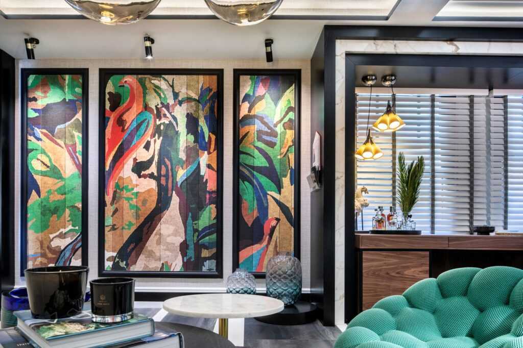
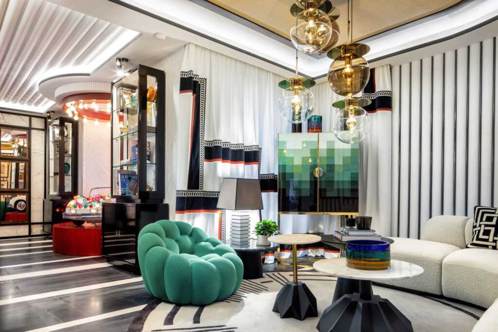
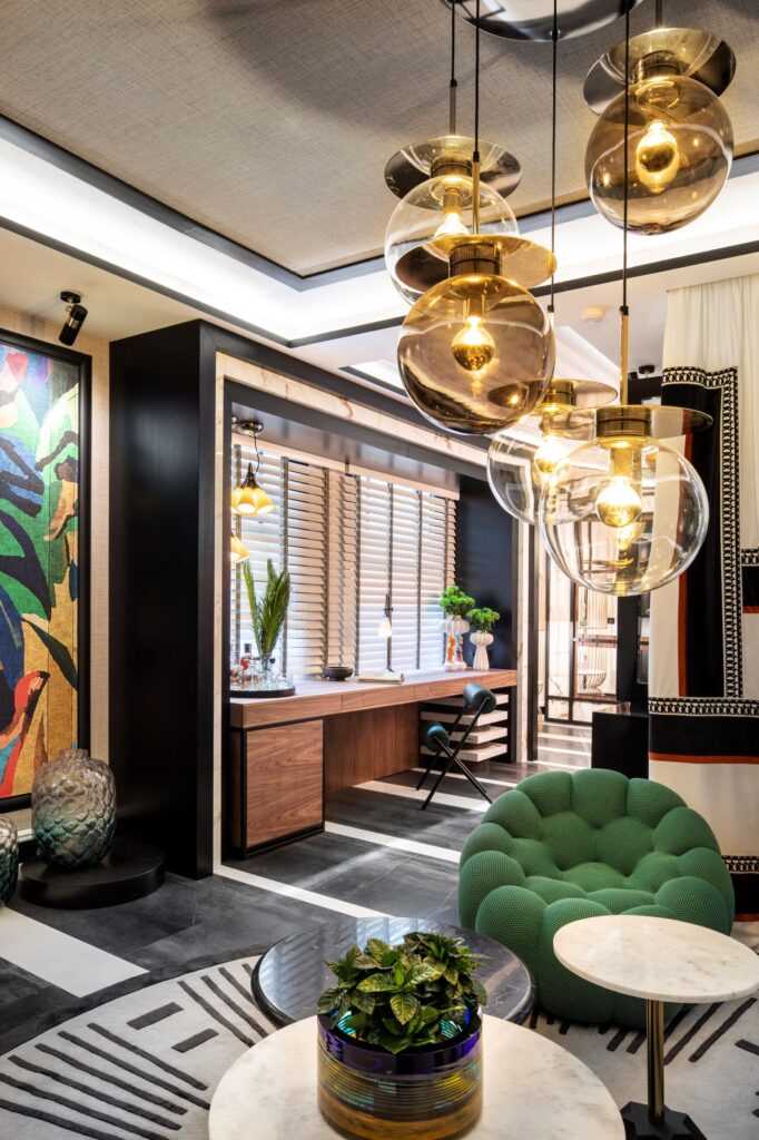
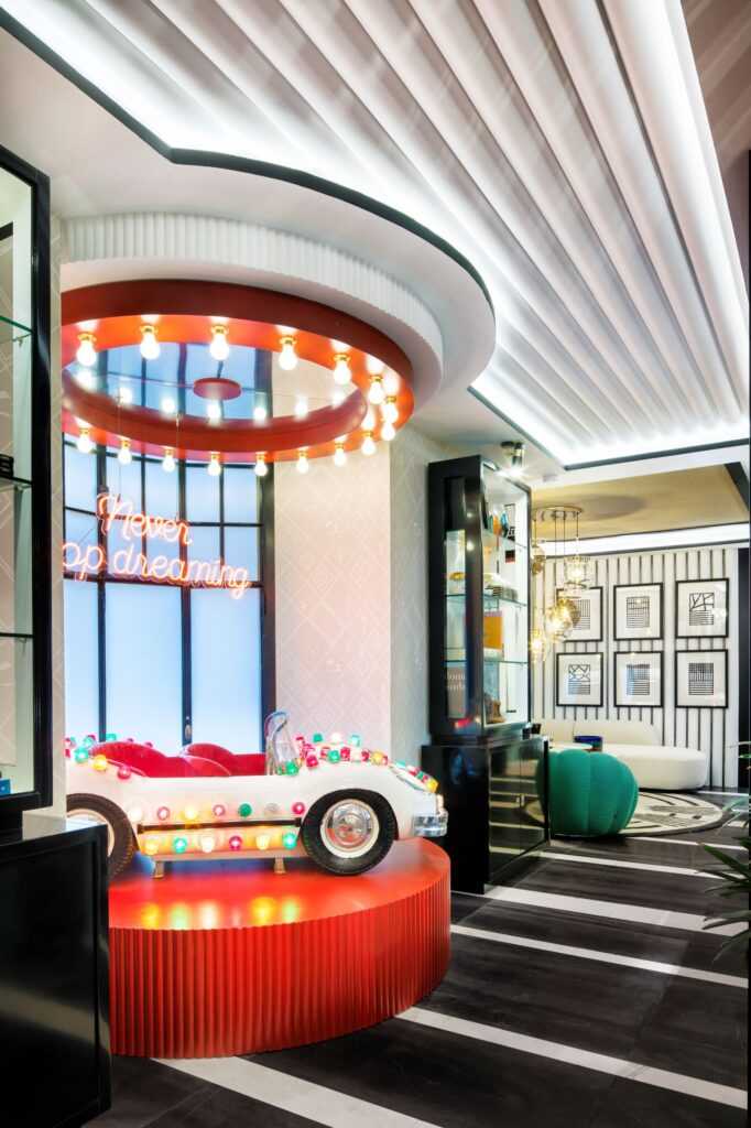
Colour and Whimsy: “Carrusel” (Carousel), Office with Play Area, Alberto Aranda Design
Photography by Luis Hevia for Casa Decor
Photography by Luis Hevia for Casa Decor
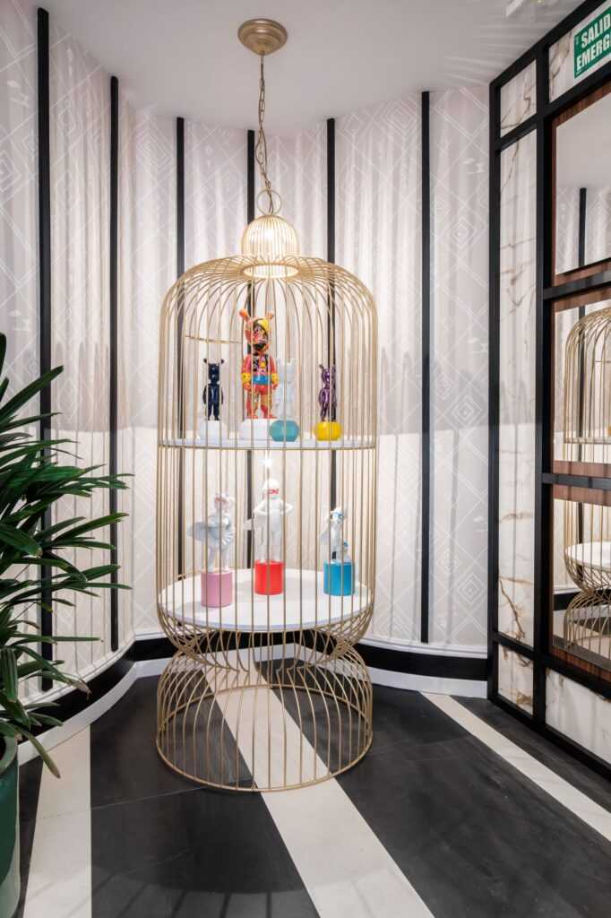
Who says that a workspace has to be somber? Not Alberto Aranda Design, the Jaen-based firm that designed this whimsical space. It is an office that expresses the innocence and immaturity of our childhood. There is a touch of colour, gaiety and madness; a toy car with candy-coloured lights, a bright red carousel, a gilded bird case with playful porcelain figurines, a neon sign with the words “Never stop dreaming.” This playfulness contrasts with the materials that indicate our entry into adulthood. Natural and noble materials, stone and wood, symbolise maturity, the hardened person we become through the different experiences we have lived through over time. Steel, glass, and stone complete the material palette. The curved forms of the accessories, lamps, armchairs and other furniture pieces achieve an appealing visual rhythm. The woods are sustainable and are for reuse once Casa Decor 2021 ends.
How did you come up with the design? What was your inspiration?
The inspiration was that child in all of us, the “Peter Pan Syndrome.” This space invites us to preserve this childlike spirit. We have highlighted the phrase “Never Stop Dreaming” on an illuminated neon sign; it essentially sums up what we want to convey.
What does participation in Casa Decor 2021 mean to you on a personal and professional level?
This participation in Casa Decor 2021 has been a personal challenge. We wanted to reacquaint ourselves with beautiful things. This edition has given back the illusion to everyone, both professionals and the general public, to see and enjoy the spaces and the new products.
What challenges did you face in organizing the space during the pandemic?
Personally, the fact of leaving my comfort zone has meant a change in my day-to-day professional life. It has also meant changing the codes I use daily and studying new proposals and new languages. Casa Decor is a great showcase and an incredible platform where I can make my work known.
Child’s Play: “Viaje a una fantasía” (Journey into a fantasy), Playing Field, Marta Labrador Studio
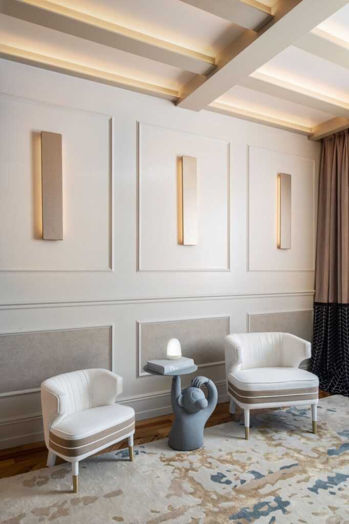
The inspiration? Stories, play, fantasy, birds, and nature. The brief? A coexistence of the world of children with that of adults. A versatile place for leisure and work. There are murals with nature-inspired motifs in muted tones. Painted linen. Classic geometry in a contemporary language. A mixed material palette: wood with lacquered finishes, glass, raffia, linen, silk, cotton, and velvet. This space by designer and master cabinetmaker Marta Labrador Studio has it all.
A Place for Everything: “Despertando sus sentidos” (Awakening your senses), Child’s Bedroom, Somos2Studio
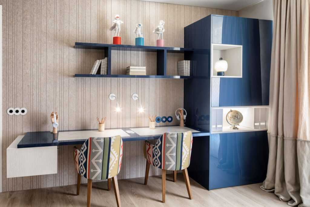
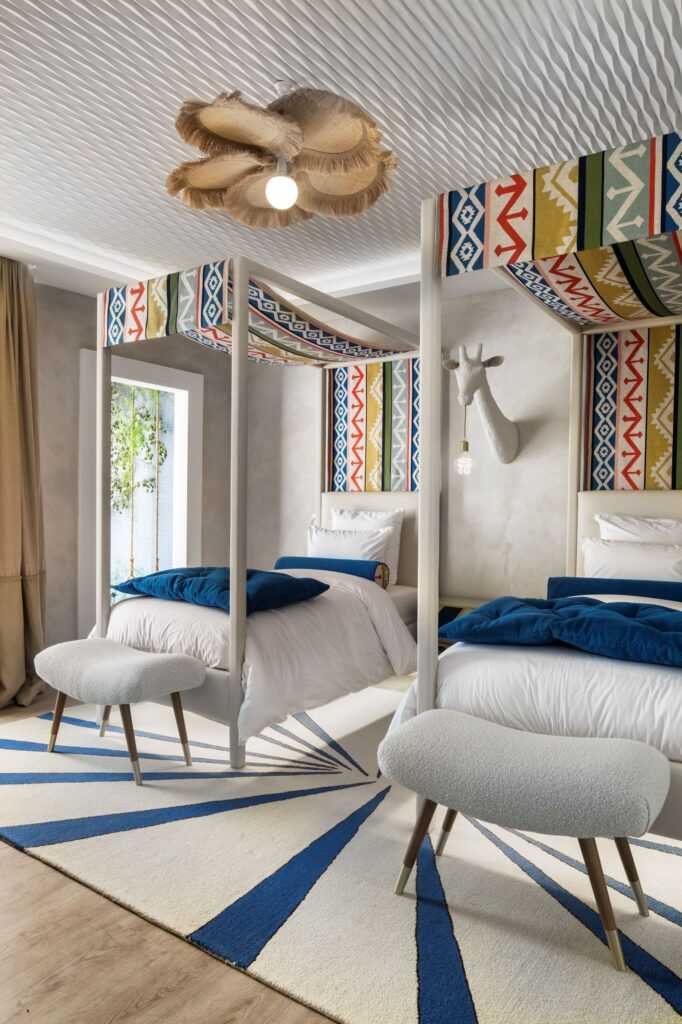

While “Carrusel ” and “Viaje a una fantasía” exalt in childhood exuberance, the colourful space by Eva Jurado and María Díaz Leguina of Somos2Studio reflects the spatial needs of our children arising from the pandemic. The bedroom combines study and rest areas for physical activity, creativity, technology, and handicrafts. There are natural fabrics, such as linen, cotton, wool. They have highlighted artisanal and handmade interior features and products as an alternative to large-scale manufacturing. They have incorporated vegetation in the play area. They have used three different sustainable materials for the panels. In the study area, the ceiling panels are made from recycled plastic bottles and are acoustic. They applied clay, a 100% a natural product, in the sleeping area.
The result is a workspace that is vibrant, functional, healthy, and sustainable.
Away From It All: “Modern Times“, Office, by the Room Studio for Gira
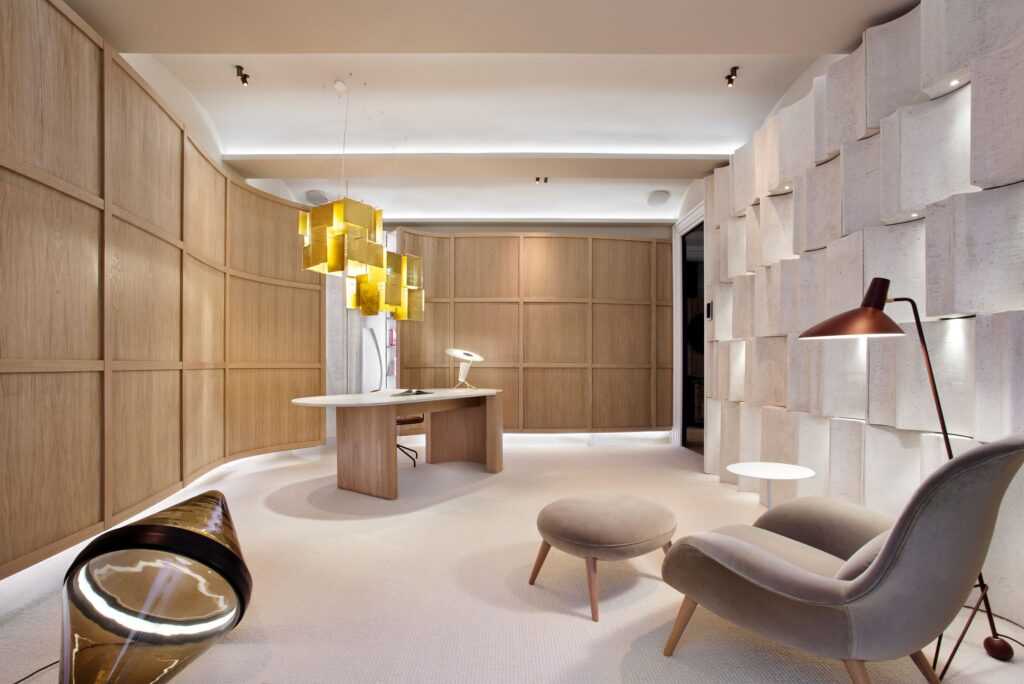
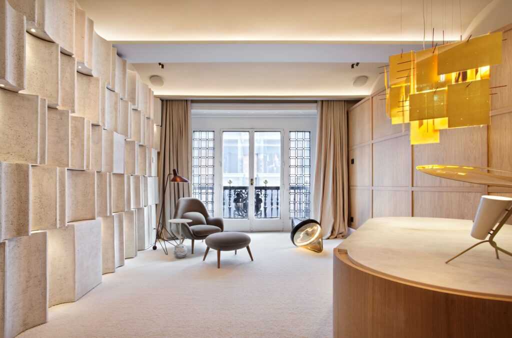
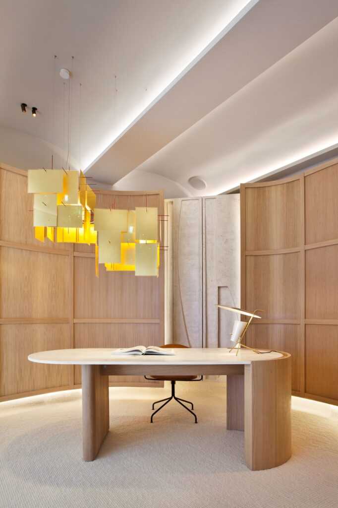
Meritxell Ribé and Josep Puigdomènech of Barcelona-based The Room Studio designed a workplace that transmits serenity. It is a sanctuary, a counterpoint to the uncertainty and anxiety under which we are living. The importance of artisanship and quality to provide a sense of security and comfort is evident in the choice of natural and sustainable materials; wood, stone, wild linens, and wool. The organic shapes of the armchair, desk, chair, and lighting fixtures give the sensation of being enveloped within the space. The wooded panel behind the custom-designed table conceals shelves that hide office materials. Smart solutions from Gira provide home automation and advanced technology that lead to energy savings. This pared-down space is not only functional but is the perfect retreat, away from the noise.
Seamless Integration: “Living Now“, Home work zone, by Diego Rodríguez for BTicino
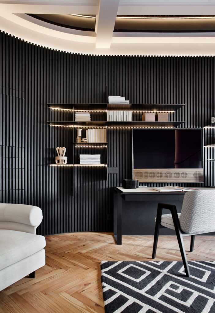
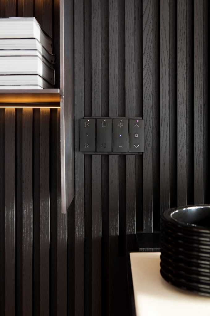
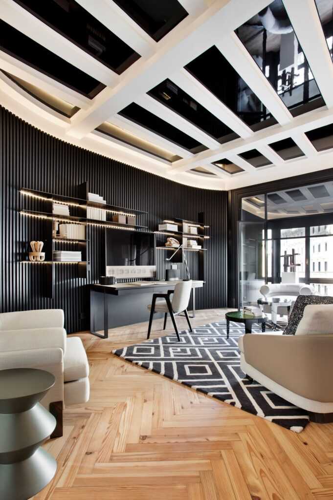
This graphic play of black and white, created by Diego Rodriguez Concept for home automation specialists Bticino is an example of how one can integrate a work area into a larger living space to serve the functions of an office and be highly impactful. Natural textures predominate. The oak woods have different finishes. The ribbed black panel behind the desk is a creative alternative to ho-hum drywall. The geometric metal shelving above the desk and the ceiling panel create depth and dimension. The overall effect is graceful and contemporary, a space that combines the classic features of the building with a modern aesthetic.
Eco Beauty: “De Madrid al Cielo” (From Madrid to Heaven), Living room, by AS Interiors for Aistec
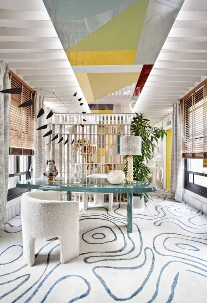
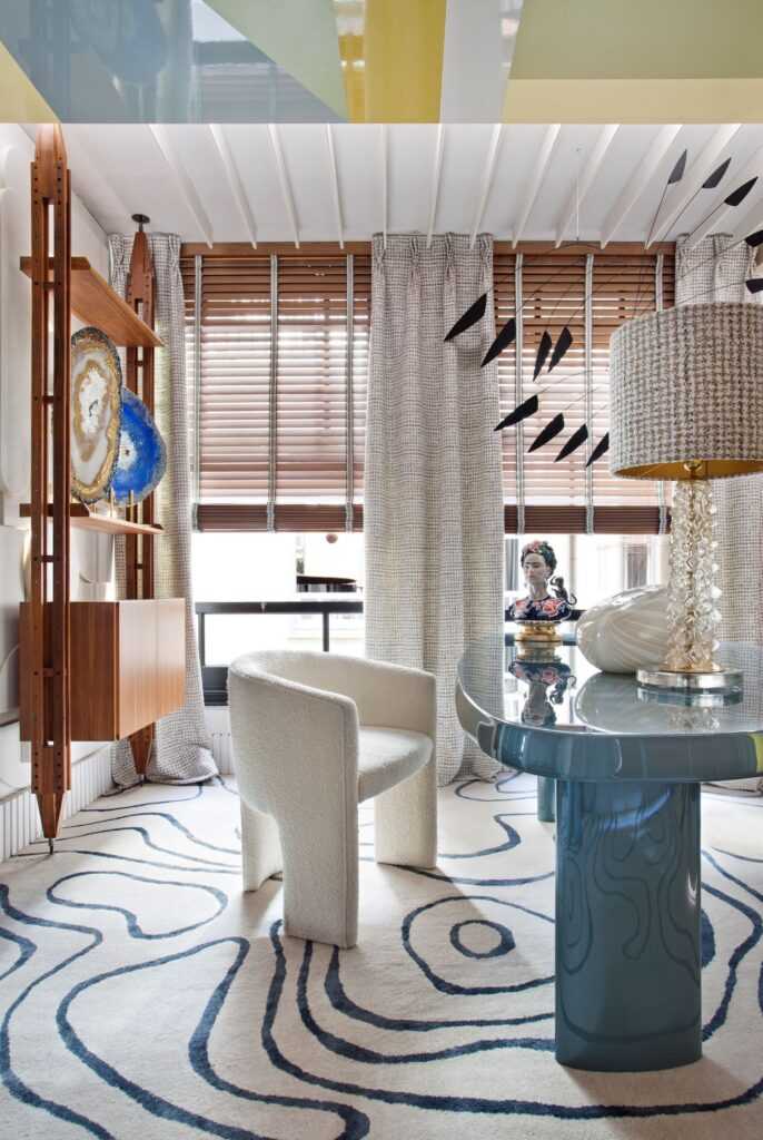
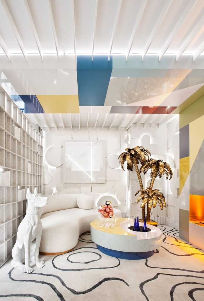
This is another workspace that integrates seamlessly into the living room. Art and light are the inspirations for this live-work space designed by Adriana Somoza and Caridad Tercero of AS Interiors (@as_interiorista) for Aistec, a company specializing in home acoustics. The ECOpanel on the ceiling is composed of 9,628 recycled PET plastic bottles. The polychromatic scheme, variety of materials (wool, silk, cotton, wood), finishes, and eclectic mix of decor and accessories are in harmony with the larger space.
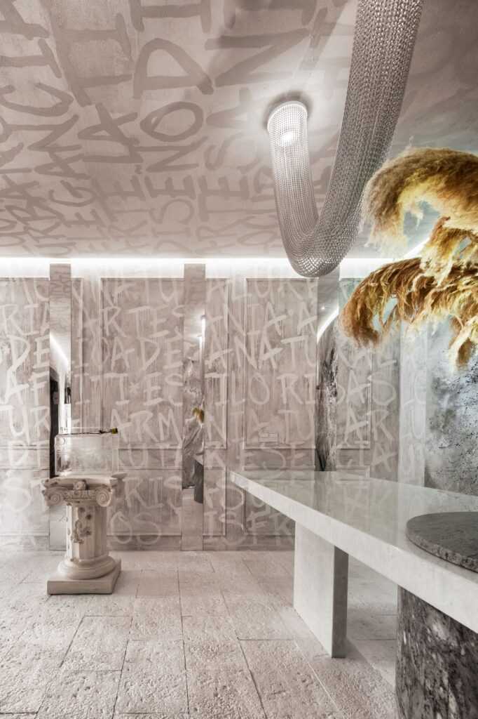
Express Yourself: “Latidos” (Heartbeat), Office, Javier Escobar Design
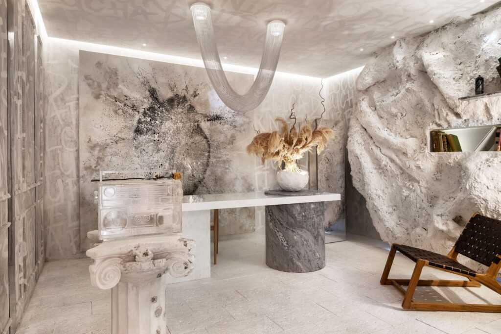
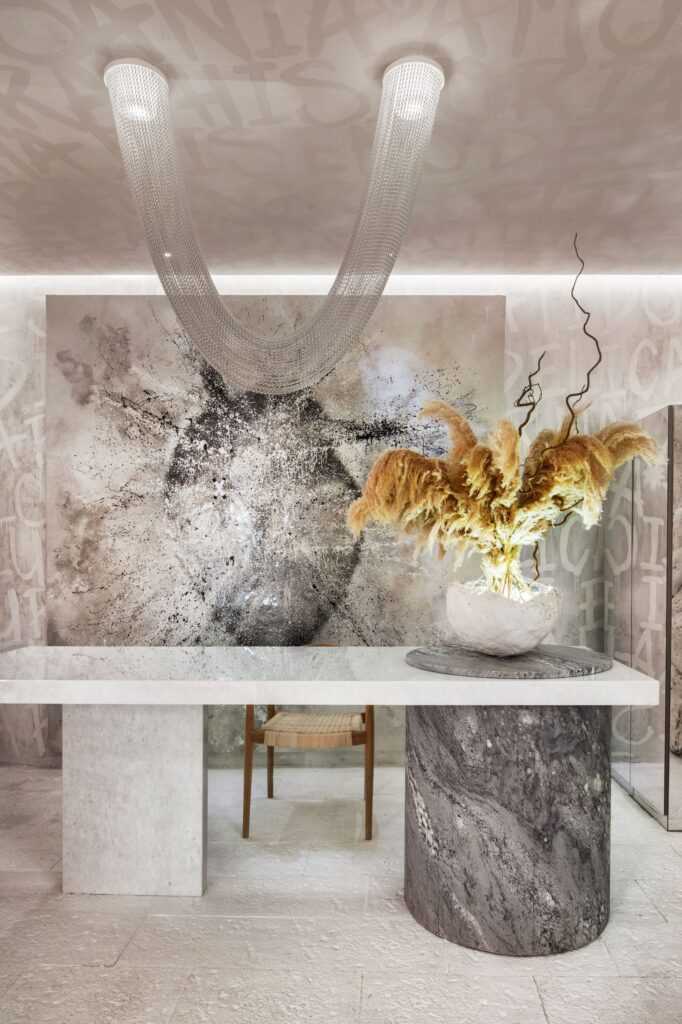
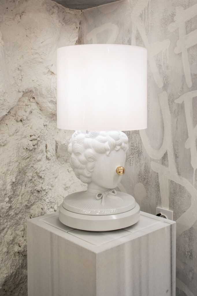
Graffiti, classical music, design, and natural elements are the purest forms of self-expression for Javier Escobar of Javier Escobar Design. Natural and sustainable materials-stone, plaster wood, marble dust-combine with inspirations from his urban environment. The space is conceptual, minimalist, and highly personal.
The Almería native designed a well-received space at Casa Decor 2020, one of my favourites. He reached out to Spain for Design to discuss his participation in this year’s event.
What does participation in Casa Decor 2021 mean to you on a personal and professional level?
A challenge accomplished. Being part of Casa Decor for the second year in a row means a lot to me as it makes me realize my professional growth as an interior designer. Being surrounded by the best designers, architects, interior designers in the sector is a point of pride.
What was the nature of your collaboration with Cosentino?
Cosentino is a magnificent company from Almería. There were no difficulties because they quickly facilitated my requests.
What challenges did you face organizing the space during the pandemic?
It was not very complicated and not an impediment to setting up my space. The brands and firms that we used for this project supplied me with everything that I needed.
What is your point of reference for the design? Is it your youth, region of Spain, dreams, fantasies?
It is a reflection of my experiences. The walls have handmade letters. From the age of twelve, I became involved in the world of graffiti. The rock wall represents nature because we differentiate our studio through our use of natural materials and crafts. The ghetto blaster shows how music influences my creative process and is also a symbol of hip-hop from the 60s.
Link to Casa Decor 2020 to view Javier’s space at last year’s edition.
Casa Decor is one of the most important design events in Spain. This year, for its fifty-sixth edition, over 200 companies and professionals have designed 55 spaces. It takes place in a spectacular 4,000 m2 building; the House of Tomás Allende in the Plaza de Canalejas and Carrera de San Jerónimo in Madrid. Completed in 1920, Leonardo Rucabado designed it for entrepreneur Tomás Allende. It is an example of the early-twentieth-century regionalist style, an eclectic architectural mix of Gothic, Renaissance, Catalan modernism, Art & Crafts, art nouveau, European romanticism, and the so-called “mountain” style inspired by the vernacular architecture in the architect’s native Cantabria.
